7 MINUTE READ
Redesigning Microsoft's Accessibility Insights
Helping developers complete accessibility testing 55% faster through clearer navigation, progress visibility, and learnability-driven UX
.png)
CONTEXT
As part of a Graduate Research Methods course, I partnered with Microsoft’s Accessibility Insights team to redesign the tool to improve accessibility testing for frontend developers.
TYPE
DevTools
B2C
Accessibility
B2C
Accessibility
ROLE
Product Designer
DURATION
6 months
(Aug-Dec 2023)
(Aug-Dec 2023)
TEAM
Microsoft PM
2 UX Researchers
1 Product Designer
2 UX Researchers
1 Product Designer
PROBLEM
Accessibility Insights is a powerful diagnostic tool, but its interface overwhelms developers on first use.
For developers using the tool for the first time, their interaction often feels less like a guided evaluation tool and more like being dropped into a complex system with no map.
They face:
• A dense list of 90+ tests
• Multiple steps to navigate
• Confusing terminology
• Unclear overall progress
• A dense list of 90+ tests
• Multiple steps to navigate
• Confusing terminology
• Unclear overall progress
For accessibility audits, speed and accuracy matter.
If developers can’t quickly find and report failures, accessibility work gets deprioritized which is a major risk for both compliance and inclusive product development.
If developers can’t quickly find and report failures, accessibility work gets deprioritized which is a major risk for both compliance and inclusive product development.
How can I help developers quickly locate, understand, and report failed tests on their first-time use of the tool, while reducing their cognitive load?
SOLUTION
We redesigned Accessibility Insights into a structured, navigable, learnable experience that guides developers toward the actions that matter most.
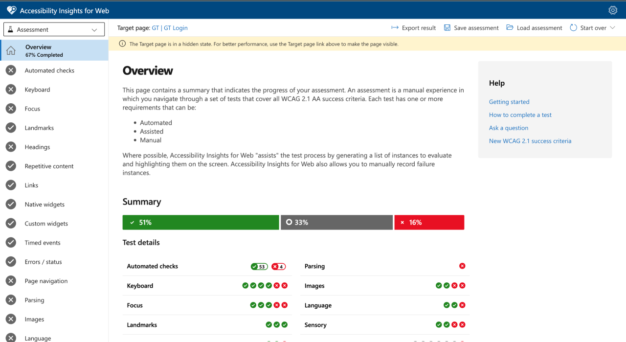
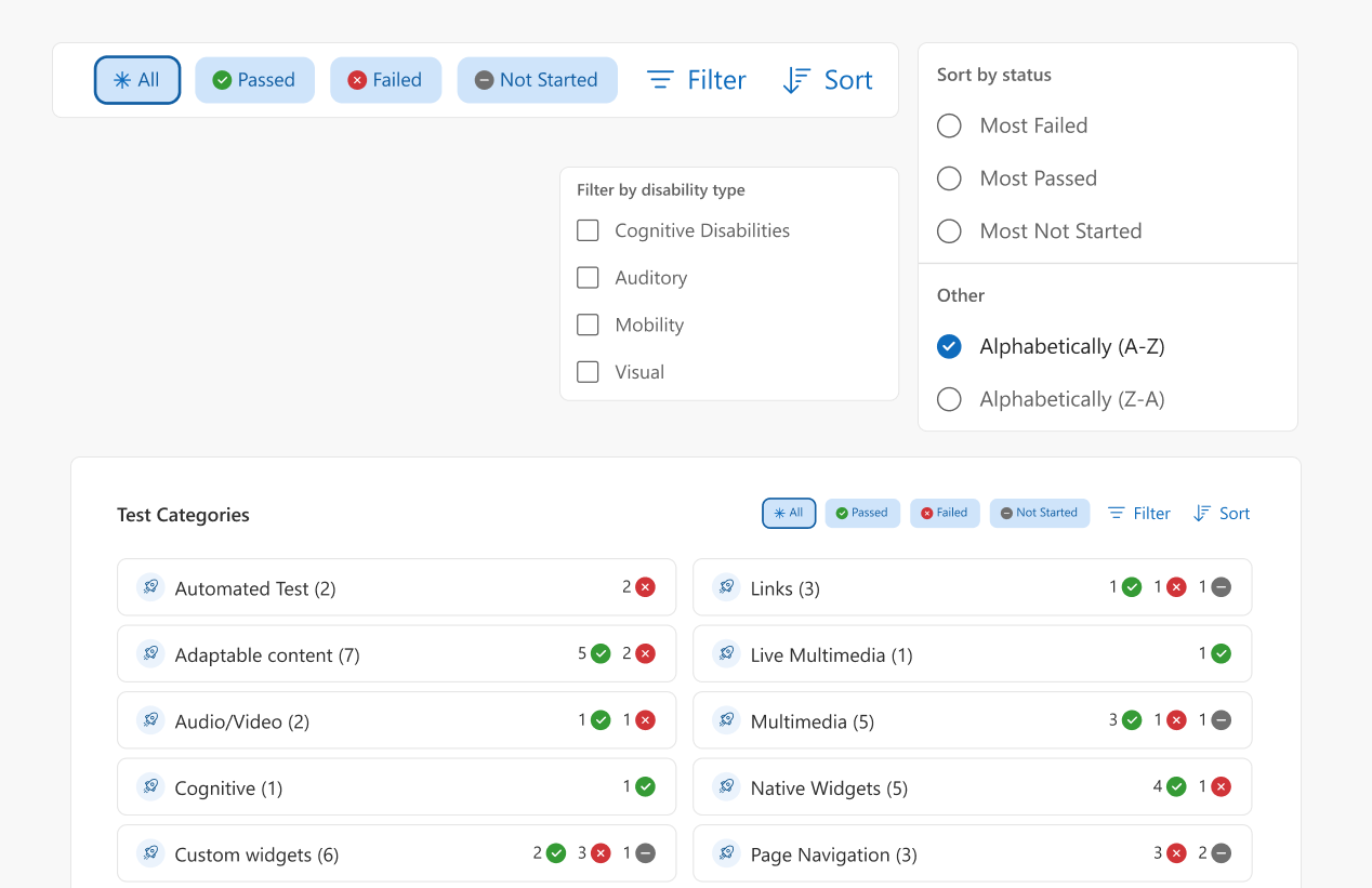
Smarter Test Organization
Developers can scan, filter, and act on relevant tests without frustration or delay.
Problem: 90+ unordered tests made it hard to prioritize or find tests relevant to the developer while testing.
Design Decision: Group tests by disability type, add filters, make them sortable, and display alphabetically by default.
"I appreciate how you guys filtered tests by modality and criticality" - Laura Waits
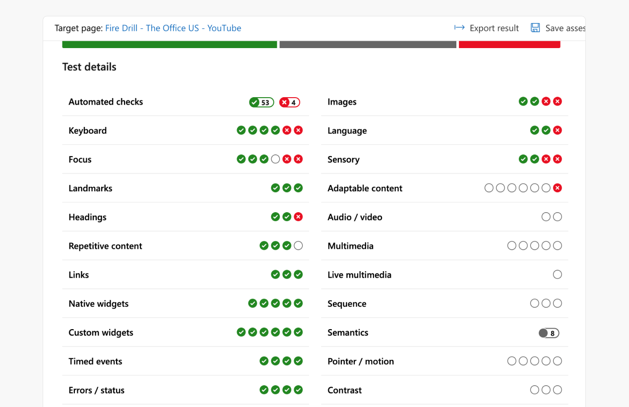
Simplified Navigation
Users now navigate intuitively from overview → test page without cognitive overload, reducing time-to-task.
Problem: Developers were overwhelmed by a dense sidebar and unclear test categories, increasing time to locate relevant tests.

Design Decision: Remove the redundant sidebar on the overview page and make test category cards directly clickable; sidebar appears only inside test pages.
"The layout looks clean, I can access the required tests quickly" - Participant
Clear Progress Indicators
Visual cues guide developers through remaining tasks efficiently.
Problem: Users had a vague sense of overall completion, causing confusion and delaying their process.

Design Decision: Introduce clear progress indicators (graphs, percentages, one-line summaries) to make status immediately understandable.
“They’d be able to check off websites based on different accessibility categories — which is a big step.” - Microsoft Product Designer
Improved Language and Heirarchy
Developers now locate and perform key actions quickly, cutting reporting friction.
Problem: Terms like “Save” vs “Export” were misunderstood, slowing reporting.

Design Decision: Rename confusing labels and position key actions near the actual test results/progress summaries.
IMPACT
55% Faster Accessibility Reporting
Reduced time to locate and report accessibility test progress by simplifying navigation, improving progress visibility, and clarifying critical actions.
Validated by low-vision SMEs
Conducted cognitive walkthroughs with 2 low-vision developers, uncovering semantic, ARIA, and keyboard-navigation improvements that informed next iterations.
Design recommendations for Internal Team
Shared solution with Microsoft Accessibility Insights team; design recommendations adopted for consideration in the internal product roadmap
Presented at Knowbility’s AccessU 2024
Shared learnings "Leveraging User-Centric Practices to Create Accessible and Learnable Tools & Experiences for Accessibility Testing" in John Slatin's AccessU Conference.
So how did we get there?
UNDERSTANDING THE PROBLEM SPACE
We began by treating the product as a user would: tool walkthroughs + secondary research + lightweight audit.
As I have previous frontend developer experience:
• Walked through the tool end-to-end, annotating friction points in Figma and Notion.
• Performed the tool’s built-in tests ourselves to see where mental models break.
• Walked through the tool end-to-end, annotating friction points in Figma and Notion.
• Performed the tool’s built-in tests ourselves to see where mental models break.

We also had a scan of user complaints on GitHub, the Chrome extension store, and developer forums.
We hypothised that developers in middle of an accessibility assessment might want quick access to failed or incomplete tests to revisit later.
We hypothised that developers in middle of an accessibility assessment might want quick access to failed or incomplete tests to revisit later.
MEASURING SUCCESS
We focused on improving the learnability of the tool for Novice Accessibility Developers (NADs)
Why novice accessibility developers?
• Improving their experience can reduce friction for all users.
• Reducing the perceived complexity surrounding accessibility
• Improving their experience can reduce friction for all users.
• Reducing the perceived complexity surrounding accessibility
Why learnability?
It's the measure of how easily users could complete tasks on first use and how quickly they improved.
It's the measure of how easily users could complete tasks on first use and how quickly they improved.
What success metrics?
• Reduce Time on Task 🕐 on the first time use
• Achieve Improvement in Learning Curve 📈
MIXED METHODS RESEARCH
We ran a 3 trial learnability study with 5 developers using the same set of accessibility testing-related tasks.
Tasks performed:
1. Start a Quick Accessibility Scan
2. Perform a keyboard navigation test
3. Locate and report failed tests
1. Start a Quick Accessibility Scan
2. Perform a keyboard navigation test
3. Locate and report failed tests

We collected qualitative & quantitative data:
• Time on Task
• Error counts
• Think-aloud behaviors
• Post-task interviews
• SUS scores
• Time on Task
• Error counts
• Think-aloud behaviors
• Post-task interviews
• SUS scores
What did we find out?
.png)
Time on Task decreased across Trials 1→2 for Tasks 1 & 2; error rates dropped to 0 by Trial 2 which implied that users were largely proficient, confirming the problem was first-time use, not long-term complexity.
Task 3 (Locate & Report Failed Tests) increased in time after Trial 1 because users were exploring inefficient workarounds due to poor discoverability and navigation.
Using the insights we found across the tool, we prioritized them based on impact and cost.

The research revealed that the core issue was the first-time experience of finding and reporting test results and we thereby focused on:
• Overview page
• Navigation architecture
• Progress visibility & terminology
INSIGHT BREAKDOWN
We learned that users didn’t need more features, they needed clarity.

Theme
Problem
Implication
Navigation
Users couldn't promptly reach tests
Enable intuitive movement between pages and tests
Visibility of Status
Assessment summary was unclear
Use clear visual indicators for progress
UX Copy
Action terms were confusing
Use clear, contextual language
Discoverability
Export was hard to find
Make key actions more prominent
ITERATING TOWARDS CLARITY
Early concepts explored many directions, but structured iteration and continuous feedback helped converge on our final solution


We went through multiple cycles of design and PM/stakeholder feedback, exploring:
• Navigation models
• Progress summaries
• Test grouping
• UX copy and terminology
• Placement of key actions
Final designs focused on reducing cognitive load, guiding user flow, and making progress visible and understandable.
• Navigation models
• Progress summaries
• Test grouping
• UX copy and terminology
• Placement of key actions
Final designs focused on reducing cognitive load, guiding user flow, and making progress visible and understandable.


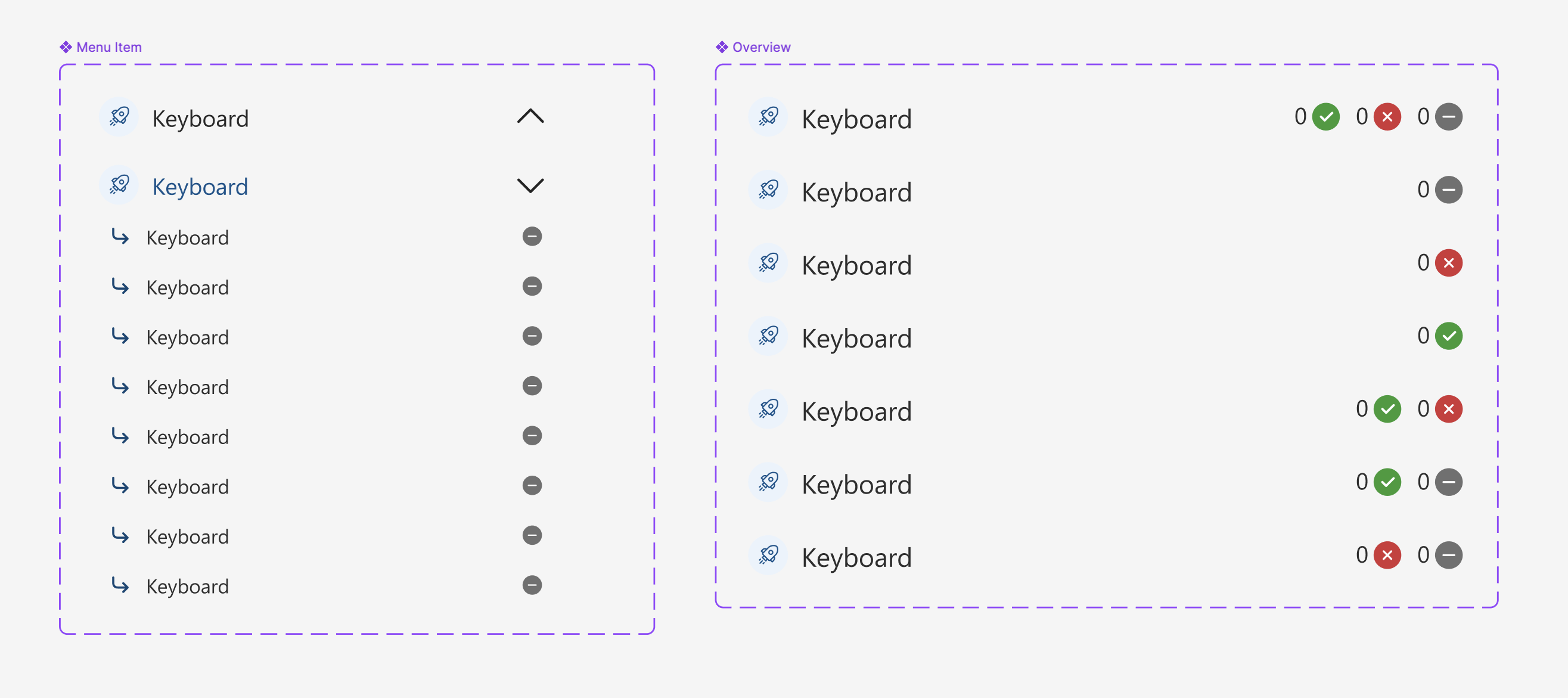
DESIGN SYSTEM
These components following Microsoft’s Fluent 2 Web design principles were designed to make progress visible on overview and sidebar.
EVALUATION TESTING
We validated the redesign by re-running Task 3: “Locate and Report Failed Tests” with 5 new developers.
What did we find out?

The average Time on Task (ToT) for Task 3 in the original design (Trial 1) was higher than that of the redesigned version.
Qualitative feedback confirmed the improvement with few criticisms
“While the navigation does not give complete status of the assessment, it is still a big improvement from before” - Microsoft Product Designer
Problem
Implication
Users were confused by the phrase “50% accessible.”
Clarify whether the percentage refers to passed tests or total.
“New Assessment” was mistaken for a static button, not a dropdown.
Add a dropdown arrow/icon to indicate interactivity.
Test categories still felt like a lot
Use progress disclosure
Disability graph is confusing
Check out data vizualiation principles
ACCESSIBILITY TESTING
We conducted Cognitive Walkthrough with 2 SMEs with visual impairment to evaluate interface for screen reader compatibility.
Tasks performed:
1. Start a Quick Accessibility Scan
2. Perform a keyboard navigation test
3. Locate and report failed tests
1. Start a Quick Accessibility Scan
2. Perform a keyboard navigation test
3. Locate and report failed tests

"Just like in maps you first see an overview of how the path is and then go into step by step directions. I first want to know how the website is structured before going into the main sections” – Accessibility Expert 2
Improving semantic structure, ARIA labeling, and alt text can significantly enhance accessibility for screen reader users. Suggestions:
• Semantic labeling of regions (e.g., “Main”, “Navigation”)
• Set ARIA roles and tab order for test categories and filters
• Set ALT text for all images and visual elements
REFLECTION
Overestimating Learnability Issues
The learnability study took way more time than we expected time we probably could have spent iterating on designs. Some of my early assumptions about the difficulty were a bit off. It was a good reminder to keep testing assumptions early and often!
Difficulty in Screen Reader Testing
Everyone uses different screen reader tools and settings, which made it tricky to prepare fully. It really opened my eyes to how complex inclusive design and testing can be, and how important it is to build flexible, user-centered tools.
Developing Judgment in Research-Driven Design
As a research-heavy project within a Graduate Research Methods course (2023), this work sharpened my ability to synthesize quantitative metrics and qualitative observations into clear, decision-ready insights. Rather than treating data points in isolation, I learned to connect time-on-task, error rates, think-aloud feedback, and interviews into a cohesive understanding of where users struggled and why.